Viva Magenta: Pantone Color of the Year 2023 in Design
Viva Magenta, PANTONE 18-1750, is the trend colour making waves in interior design with its energetic spirit and lively character. Bold and expressive, it inspires creativity and brings renewed vitality to interior architecture, opening up a wide range of exciting possibilities.
Following the softness of Peri Winkle, Viva Magenta marks a vibrant shift in the pink spectrum, adding strong contrast and dynamic presence to any room. But how should it be used in design? With thoughtful placement, a softer approach in selected areas and a well-balanced combination of tones, this trend colour can completely transform a space making it feel fresh, contemporary and full of personality.
The meaning of Viva Magenta Pantone 2023 color in interior architecture
Viva Magenta is a tone that, as its name anticipates, combines shades of magenta, carmine and fuchsia, creating a bright and attractive mix.
The Pantone 2023 color is therefore a vivid red-based tone, reminiscent of the vigour of one of the most popular natural dyes in confectionery, cochineal.
From here we can say that the meaning of Viva Magenta is exemplified in the words passion, personality and dynamism. Indeed, this color exudes life force and can be used in interior architecture to give a note of creative spontaneity. However, it is important to act with balance when choosing this tone.
The advice is not to use it purely: as a bright color, excessive use of Viva Magenta can become tiring for the eyes. The solution is therefore one of moderation and harmony, considering combinations with other colors.
Color trends 2023 and matching with Viva Magenta for interior design
In the 2023 color trends for interior design, Viva Magenta is used in a variety of different ways.
Taking the four Pantone 2023 color palettes - Equilibrium, Resonance, Family Ties, Ignite - as a reference, we can get a more exact overview of the potential of Viva Magenta, the Mix & Match with other shades and the design advantages in interior design. Here are some ideas.
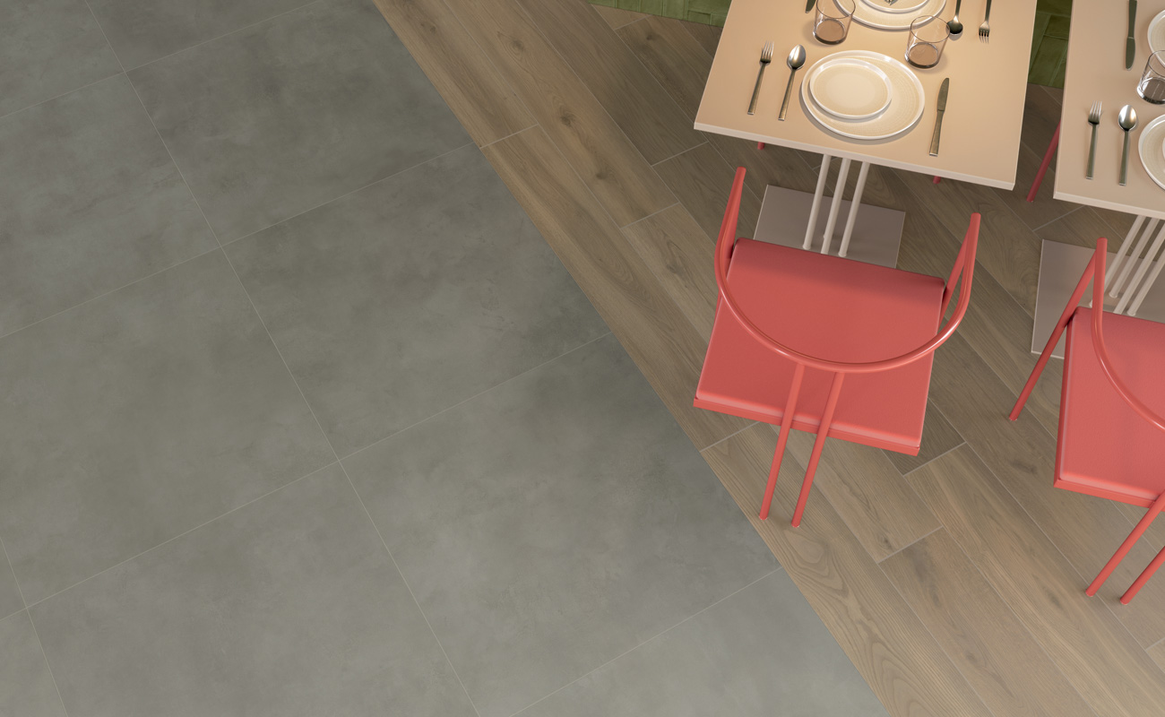
Viva Magenta and neutral colors (grey or beige)
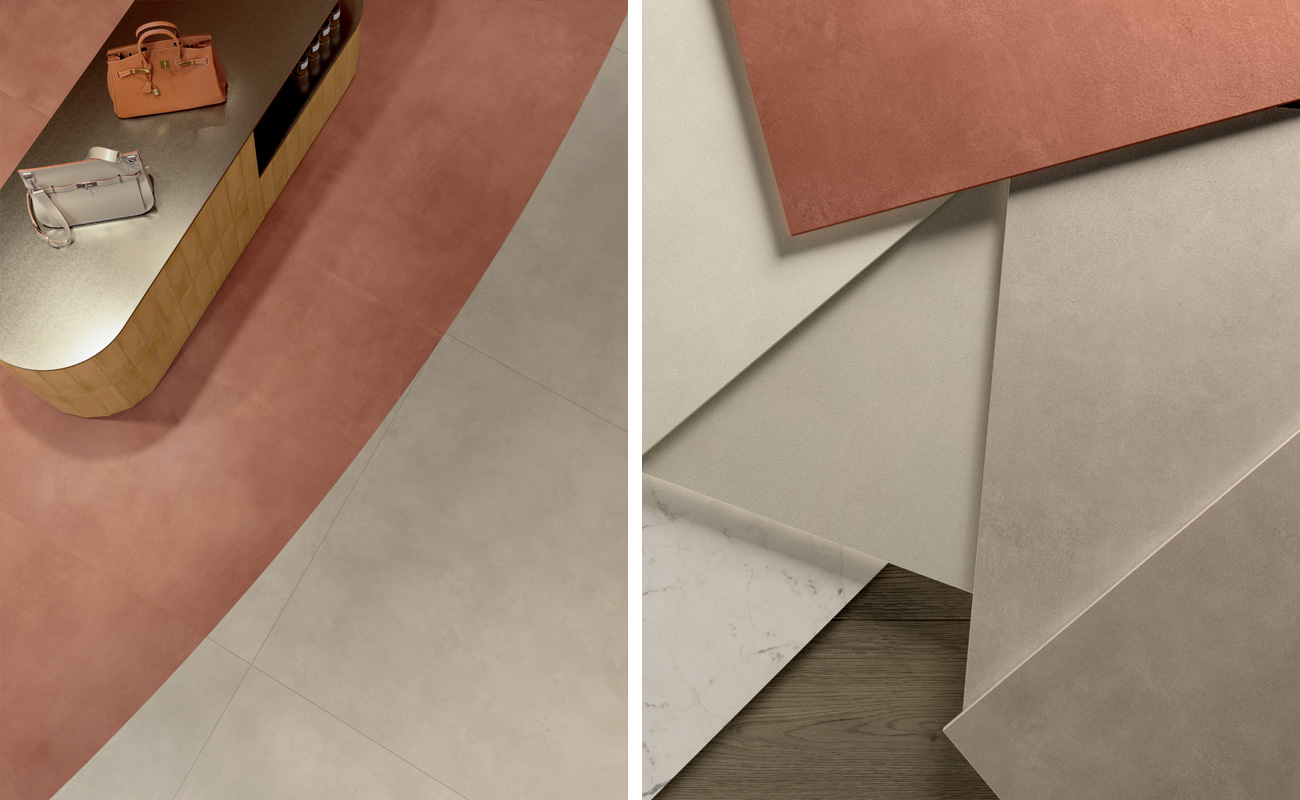
Right in the Equilibrium color palette is the Ultimate Grey grey, which - being at the opposite pole of Viva Magenta - is perfect for creating a dynamic and contemporary contrasting look.
In this sense, the concrete effect or the natural stone effect of the latest generation of ceramic surfaces can be a valuable ally.
Be it large porcelain stoneware slabs or small size tiles, the result is guaranteed both on the floor and on the wall.
Viva Magenta can also be successfully applied combined with beige. Here the reference Pantone 2023 color palette is Ignite where we find neutral tones of Pale Khaki and Field of Rye.
In this case, the wood effect is strategic for sure, especially when used as a floor tiling.
Viva Magenta and pastel colors (light blue or green)
If we want a fresh and dynamic environment, such as a modern office, living room or bathroom, Viva Magenta can be:
- main color of walls and partitions;
- accent color for furniture or design elements to create a focal point in the room.
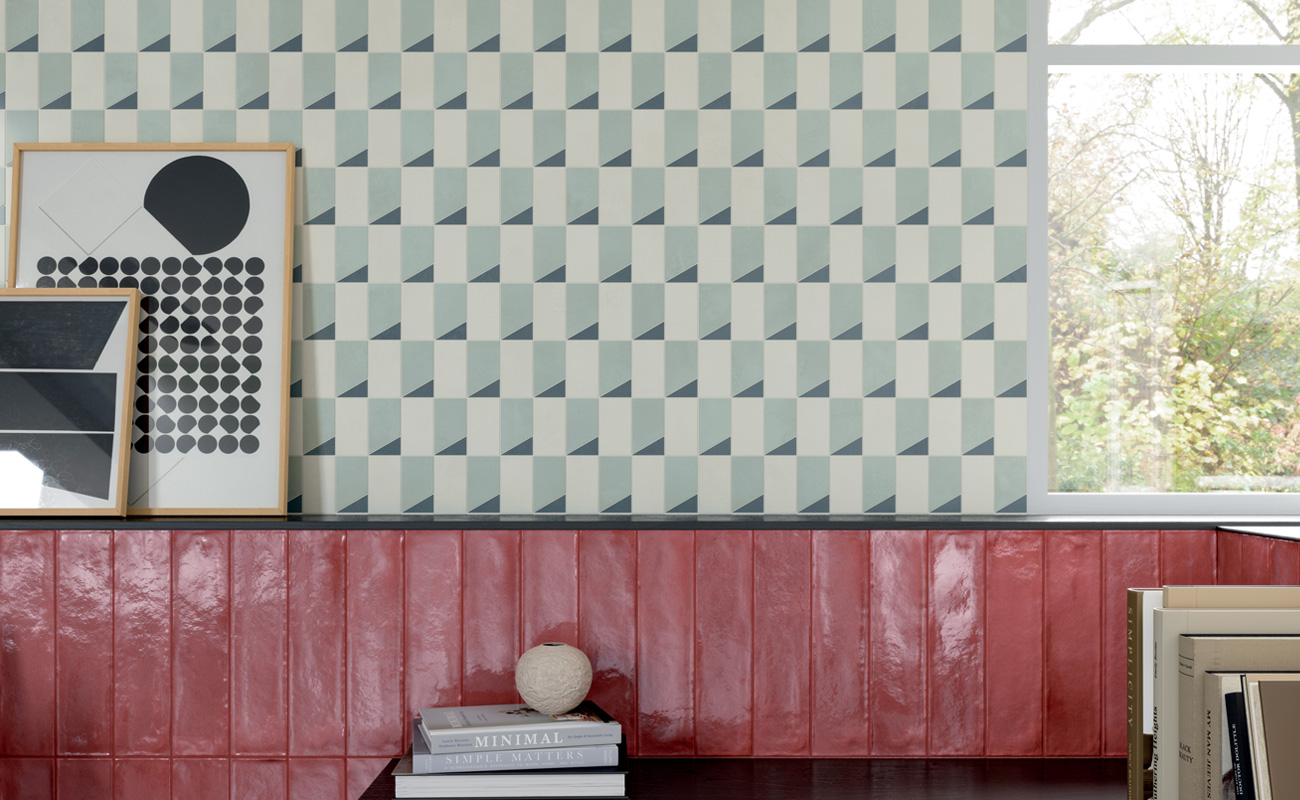
In the first example, the combination with pastel blue again recalls the Ignite palette and specifically the Plein Air color, which here helps to brighten up the layout while maintaining a classic and refined appeal.
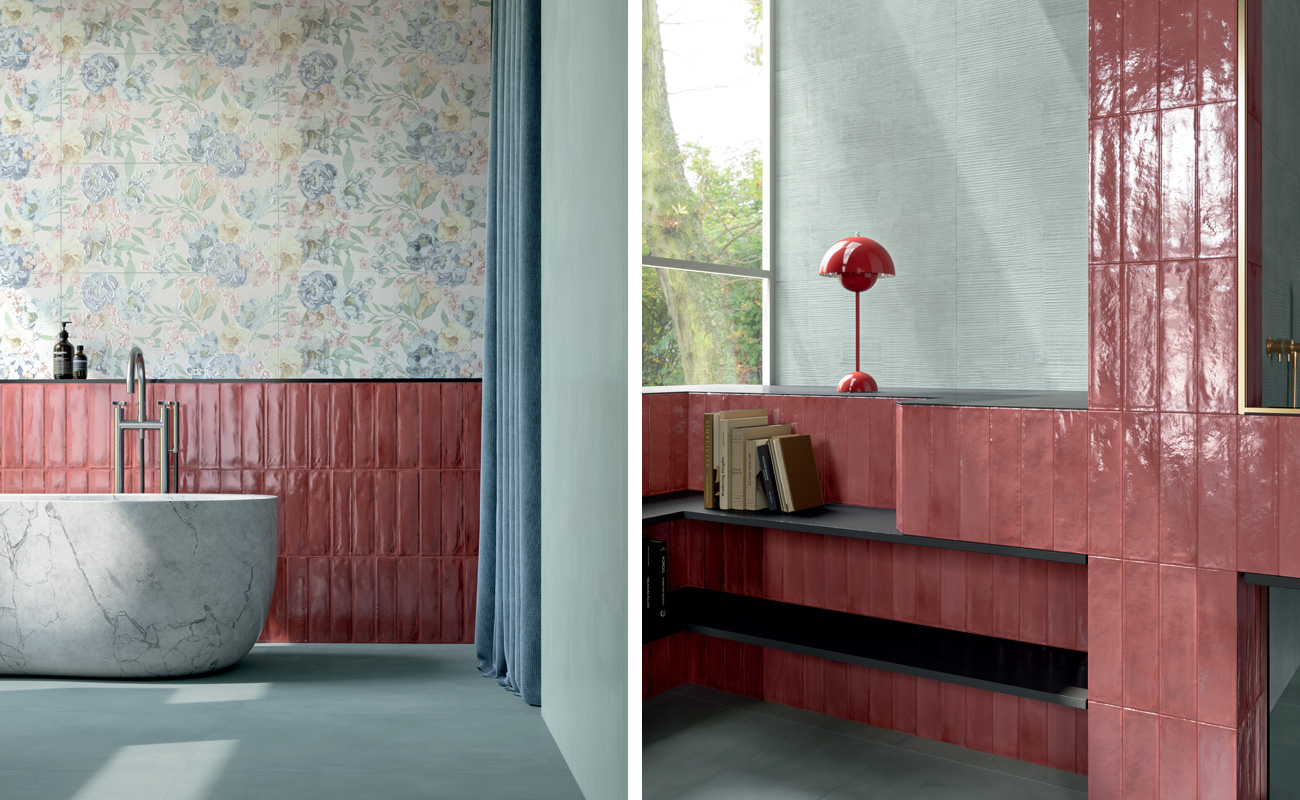
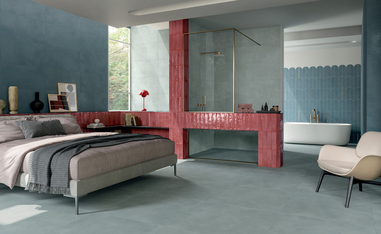
In this layout the choice of ceramic bricks is essential, because they provide a jaunty but still elegant atmosphere with their glossy effect in shades of Viva Magenta.
Also very interesting is the combination with optical-style porcelain stoneware surfaces, which make the Pantone 2023 color even more graceful and sparkling.
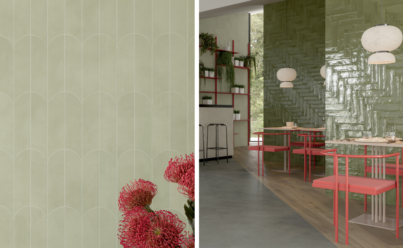
The design effect through the use of Viva Magenta and pastel tones also continues in the combination with green.
Taking inspiration from the Resonance palette, where we find Fir Green and Silver Pine, we note that the different shades of green - olive, sage, moss and mint - balance the Pantone of the year 2023, bringing it back to a natural and relaxing dimension.
In this second example, it is precisely the use of Viva Magenta as an object, accessory or design element that is recommended, so as to add a touch of class through detail.
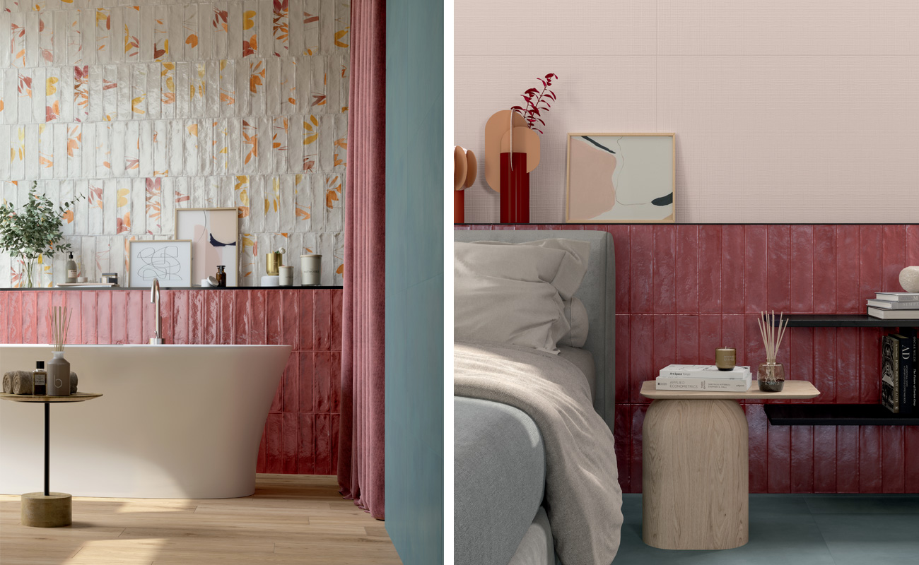
Viva Magenta and dark colours (black or brown)
We explained how Viva Magenta can give a boost of energy and vitality to different types of rooms.
This makes it ideal for rooms where you need to be creative, especially if they are designed to accommodate a look featuring the dark tones of black or brown.
The combination of Viva Magenta with black creates a sophisticated and glamorous effect. Again, this is a very obvious game of contrasts, where it is best to calibrate the components and draw attention only to specific elements of the furnishing.
As far as brown is concerned, we also find it in the palette called Family Ties, which is also the one with the shades closest to the essence of Viva Magenta Pantone 2023 color. Here we have, for example, Mystica, a shade reminiscent of dark wood effect , which helps to create a warm and cosy atmosphere, even in the presence of flashy details.
How to choose the right color for your project
Viva Magenta is a bold but effective color choice for creating a trendy and attractive place. It can be found in various contexts, from home to office, from hospitality to commercial.
In this article, we guided you through the different combinations to best bring out your idea of style. But how do you choose the right color for your project while also having a complete overview of the textures, patterns and surfaces you can combine?
If you're looking for a guide that can breathe new life into your interior design concept, the in-depth study Stili di Marca is what you were looking for.