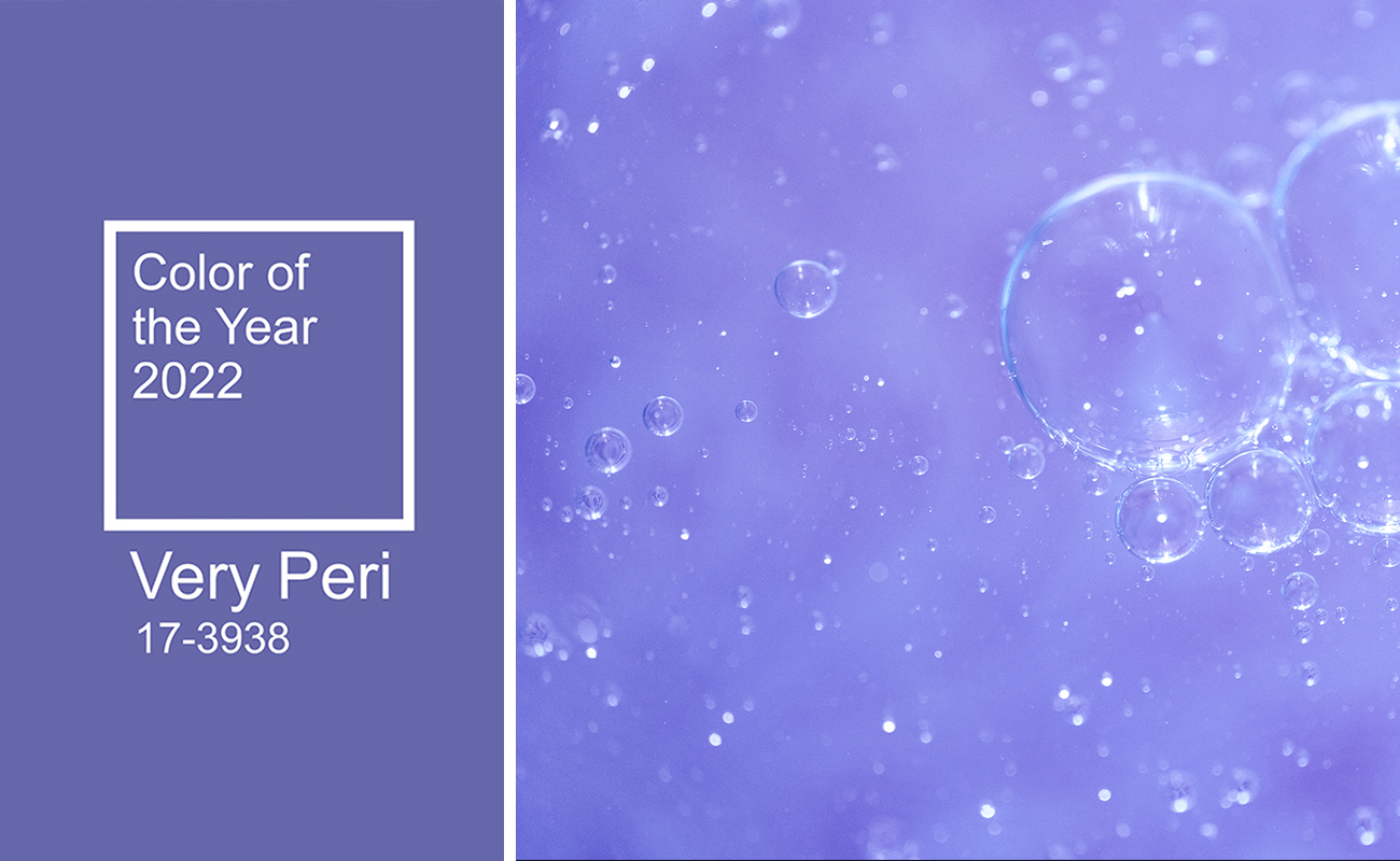
Very Peri: the Pantone 2022 color
Room for creativity with Very Peri, Pantone 2022 color of the year
For more than 20 years, Pantone Color Institute has been setting color trends, selecting one color (or in some cases two, as in the case of Illuminating and Ultimate Gray for 2020) that will influence the world of fashion, design, technology and lifestyle.
The Pantone Fashion Color Trend Report 2022 has identified a new hue that best expresses the hope for rebirth and change that we are all looking forward to, naming Pantone 17-3938 Very Peri as the 2022 color of the year, whose bold presence stimulates inventiveness and personal creativity.
Leatrice Eiseman, Executive Director of the Pantone Color Institute, comments on this challenging and ambitious choice:
"As we move into a world of unprecedented change, the selection of PANTONE 17-3938 VERY PERI displays a sprightly and joyous attitude and dynamic presence that encourages courageous creativity and imaginative expressiveness."
The Pantone 2022 Color Very Peri embodies the conciliatory forms of blue, skilfully mixed with the liveliness and dynamism of a violet-red undertone, resulting in an entirely new hue with a complex soul: a true brushstroke of hope, optimism and joy seasoned with just the right amount of melancholy and nostalgia for happier times.
No doubt, we can already state that this color will be the undisputed star of catwalks, events and interior design projects, too!
Are you fascinated by the modern style and good vibes of Very Peri violet-blue color, but afraid it might be too eccentric a color to use for your project?
Have no fear! We have prepared for you some tips on how best to use Pantone 2022 to renew your interior design.
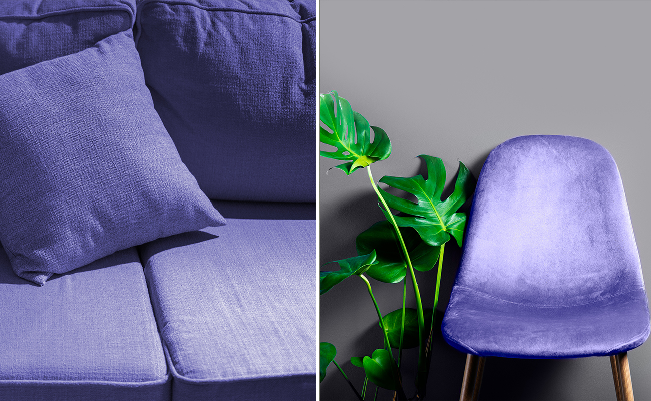
First, we do not recommend using this color for surfaces all over the house: in the long run, you might get bored with it or, even worse, hate the rooms where you spend most of your time!
It is much better to use the color of the year - Very Peri - for furnishing accessories, such as sofas, textiles, pictures or crockery.
Enhance the Pantone 2022 color with a harmonious palette
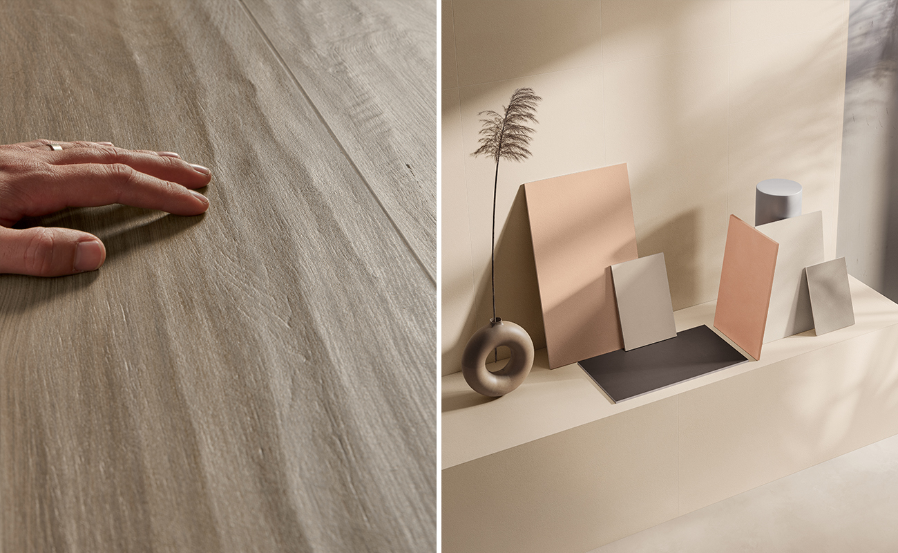
The fundamental step to avoid regrettable mistakes is undoubtedly to compose a color palette to be used in the choice of furniture, floors and walls and with which to play with the possibilities of matching Very Peri.
For example, you can make the Pantone 2022 color stand out by combining it with a range of classic, neutral shades, such as the elegant Elisir Royal wood-effect boards in Fumé, or the silky surfaces with their exotic appeal of Overclay.
Both tile collections are featured by their discreet and understated elegance: they become the ideal setting for more eccentric furnishings and vibrant colors for floors and walls, such as the Pantone 2022 color, Very Peri!
A nature-inspired modern style for your interior design
Transform your environment into a true celebration of nature and its bright, charming colors, by combining the positive soul of Very Peri with the delicate impressionist decorations of the Lilysuite wallpaper-effect wall tiles, or the optical, irreverent greens of the Paprica encaustic tiles.
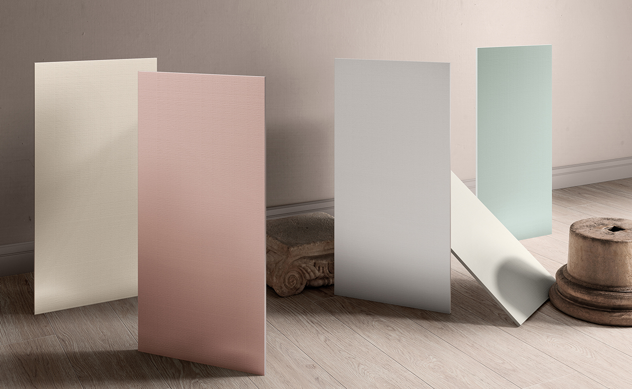
Or you can opt for a mix of colors in more balanced and desaturated warm and cold shades, such as the sage green and Foliage decorations of the Multiforme surfaces or the pastel Victoria wood wall panelling, which can intensify all the vitality and beneficial properties of the Pantone color of the year. From the first glance, you get the sensation of an environment with attention to detail, bright and with a powerful personality.