Decorating interiors with peach colour. All the potential of the Pantone colour 2024
Journey into the 2024 colour trends with Peach Fuzz, the peach colour of the year and Pantone 2024. Here's how to match it.
The Pantone colour 2024 Peach Fuzz invites to sharing and welcoming. It's a soft and - as the name suggests - "fuzzy" shade that offers great potential for interior design, with combinations that are anything but obvious.
If in past years the trend had favoured more exuberant colours such as the periwinkle blue of Very Peri and the vibrant magenta of Viva Magenta, in 2024 the choice returns to warmer and more intimate tones, for a modern elegance that fully meets the demands of today's interior design, increasingly oriented towards the well-being of mind and body within spaces.
But once you establish that the peach colour is "fashionable" and helps you feel at home in any context, what are the tips and best practices to apply when combining the Peach Fuzz in both residential and commercial interior projects?
Let's find out together.
Furniture and colour of the year 2024. Peach Fuzz in contemporary interior design trends
Peach in orangey-pink tones, Peach Fuzz is considered a new 'neutral', ideal for conveying warmth, empathy and sharing, especially when used on wall as furniture in its own right.
Highly rated for bathroom design, the colour of the year 2024 does not disappoint in terms of versatility and use in other types of spaces where comfort and balance are crucial: living rooms, lounges, offices, bedrooms and more.
In the 2024 colour trends, the Pantone of the year thus represents a contrast to previous design choices, especially if we refer to the Pantone 2023 Viva Magenta.
However, we will see below how this "nourishing and velvety" peach colour can build all-round colour alliances, not only with apparently discordant shades but also with harmonious and varied colour palettes.
Matching and harmonising with Pantone 2024 colour palettes
Among the virtuous characteristics of the Pantone colour 2024 is certainly its ability to collaborate and integrate in various contexts, both in its pure, monochrome version and in combination with other trendy colours.
The guidelines for the use of Peach Fuzz see five main colour palettes, ranging in colour from the most neutral to the boldest:
- Peach Plethora
- Libations
- Flavor Full
- Hybrid Hues
- Pairings
Going into detail and comparing these remarks with the 2024 colour trends, it appears that:
- Peach Plethora reflects a matching tone palette, where the monochrome enhances the different shades of peach, from the lightest and softest to the fullest and brightest.
This option makes it possible to create a visual continuity-aesthetic that plays on depth and variety of solutions, particularly appreciated in domestic spaces where a consistent and balanced look is desired, such as day/night ones.
In this sense, the palette is particularly enhanced at floor and wall tiling level, with walls in the foreground for a reassuring and measured accent.
- Libations is the first colour-matching option that begins to move away from the shades described above.
Always elegant, this palette is characterised by a mix of delicate yet distinct colours, creating balanced contrasts between warm and cold tones.
From this point of view, the peach colour of Peach Fuzz matches very easily with both alternatives, somewhat reminiscent of the atmosphere of fine international cocktail bars.
The Libations combination is therefore particularly suitable for commercial settings where sophistication is a must, such as lounges, lobbies, reception rooms, etc.
Here surfaces can vary, providing combinations with the marble effect in its new creative applications, the wood effect or other decorative patterns such as the wallpaper effect or the brick in small size.
- Flavor Full already leads from the name to a "fullness" of range, with colours ranging from yellow to magenta, in their brightest and most eye-catching proposals such as mango or punch red.
This Pantone colour of the year 2024 palette needs extra attention, as the risk is to create too obvious or discordant decoration proposals.
Therefore, the advice is to act with an expert eye, choosing this alternative for the interior of a modern, dynamic home or for top design-oriented commercial premises.
With respect to the home application, Flavor Full can be the palette to use to achieve a pop kitchen - so fashionable in 2024 - or a lively and cheerful children's playroom.
- Hybrid Hues focuses on the dichotomy of strong colours, with a Mix & Match that winks at maximalism and mixes apparently distant proposals to create harmonious and unexpected combinations.
The result is intriguing and sees Peach Fuzz as the protagonist of a bold and defined style statement, suitable for contemporary projects with a creative soul such as exhibition spaces, art studios or residential interiors in search of a modern, unconventional identity.
This solution is indeed very useful for creating focal points or visually dividing spaces
- Pairings is the last but not least indication in the 2024 colour trends with the Pantone of the year.
A palette of opposing shades, Pairings embodies an invitation to dare through energetic and irreverent combinations, to be used sparingly.
Designed for those who want to achieve a strong visual impact in otherwise neutral contexts, it is ideal for spaces where accessories, objects, works of art need to be accentuated or for niches, walls and corners that want to display a touch of dynamism.
Examples in furniture and interior design inspired by the Pantone colour 2024
We saw how the Pantone 2024 colour palettes allow a very broad spectrum of opportunities for interior designers, planners, architects, interior decorators and addicted of interior architecture.
The watchword is therefore experimentation, in accordance with the latest innovations but also respecting taste, style, personality and functionality of the projects
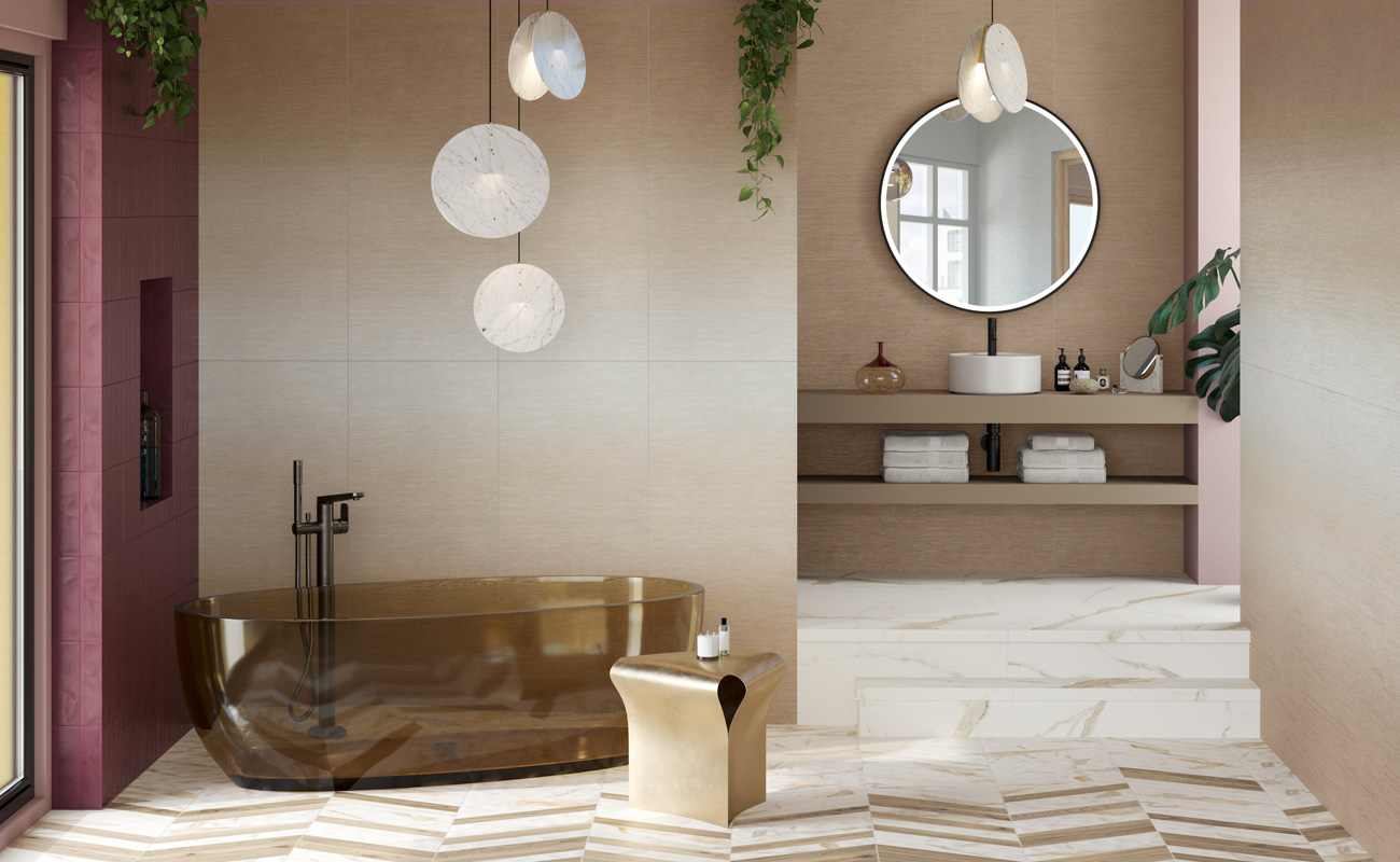
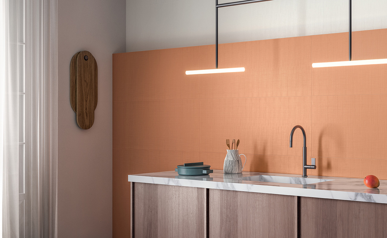
Peach colour in purity
A delicate thread running through the entire room: this is how the pure peach colour comes to life in the Peach Plethora palette.
To also recreate the typical gradients of Peach Fuzz, the Degradé surfaces of Iridea are true innovation and amazement for wall coverings in the same colour.
The essence of light and colour, this collection allows for creating beautiful settings of natural and cosy nuances: the shades Iridea Degradé Cannella and Iridea Caramel transform spaces into places of peace and serenity, expressing simplicity of combination together with infinite horizontal or vertical customisation.
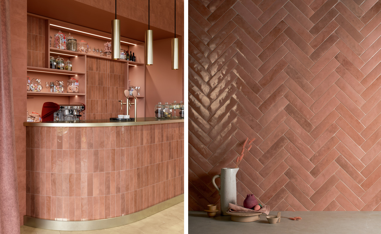
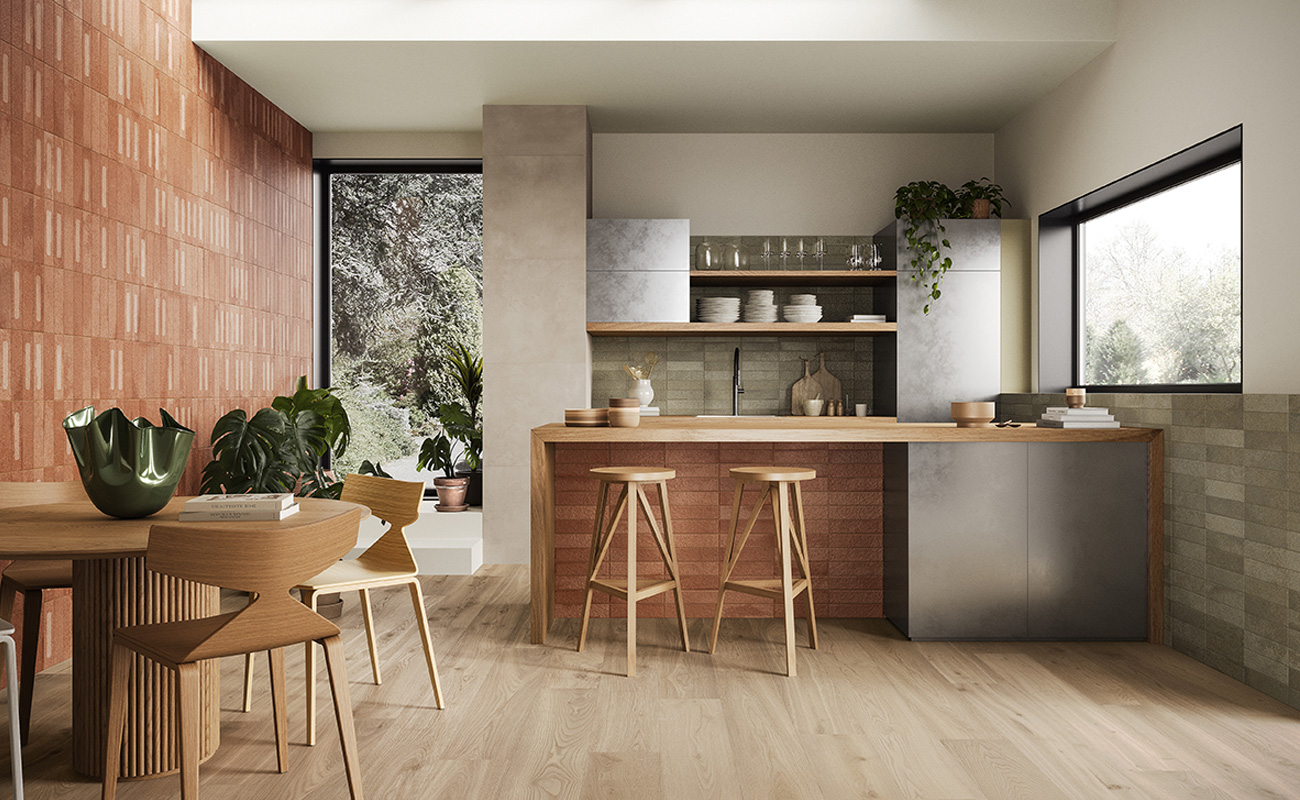
Peach Fuzz and wood effect
Intense and elegant colour contrasts in the combination of Peach Fuzz applied as a furniture element and the beige of the wood effect floor.
Miniature Soda Corallo translates the unmistakable bright depth of glass in a surprising way, reinterpreting it in a ceramic key through the versatility of the 6x24 cm small size brick.
Ideal for creating refined decorative effects and customising spaces of various sizes and dimensions, Miniature Soda is the collection of the linea 1741 by Marca Corona that narrates a new expressive force for projects with a high visual and experiential impact.
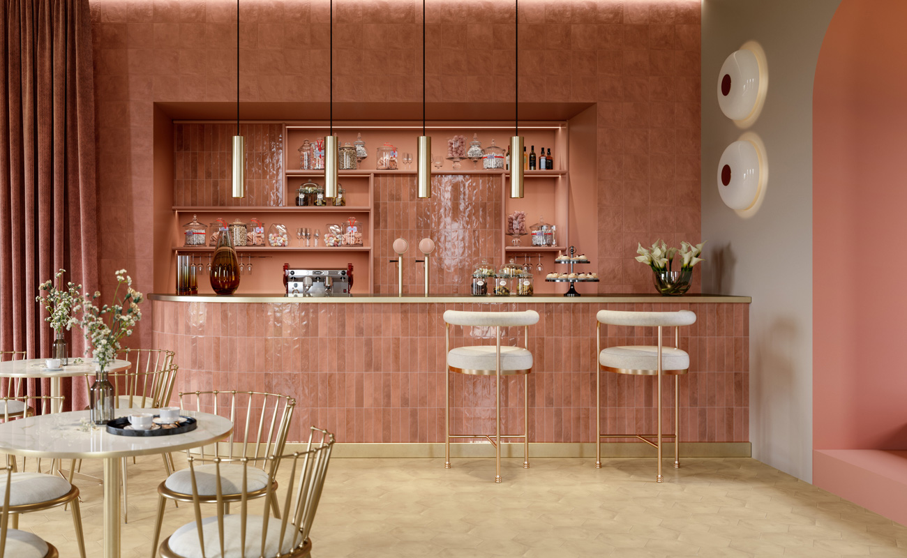
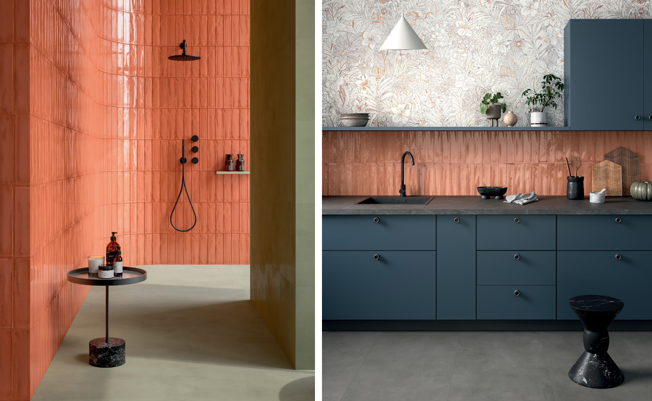
Round flavour with spring palette colours
Stimulate cheerfulness with design solutions with a rounded flavour, thanks to colours that bring spring into every room.
Flavor Full’s eye-catching palette takes the colour peach in its brightest and most orangey dimension, here proposed in the wall tiling of Lilysuite.
This collection is inspired by the tones of nature, bringing the atmospheres of the Indoor Garden directly into the interior design, also in combination with playful optical or floral solutions.
Ideal for transforming spaces by enriching them with warmth, brightness and positivity, the Peach Fuzz becomes a brilliant accent to create a truly fun pop kitchen in line with the personality of the home, while ensuring practicality and durability at the same time.
In this sense, the practical 50x120 cm size of Lilysuite wall tiles makes it easy to move and install the slabs, minimising the presence of joints and thus guaranteeing maximum continuity of colour, for a flawless colour result.
Hybrid warmth and elegance for trendy walls
In the context of modern interior design, the Pantone colour 2024 lends itself beautifully to creating trendy walls that incorporate design elements that speak of both warmth and hybrid elegance.
With the Hybrid Hues palette, this sophisticated yet subtle nature can be enhanced, dosing the dichotomy of strong colours strategically so as not to overload the space and ensuring the composition of a room that is as timeless as it is innovative.
The solution to achieve this is to take advantage of highly versatile small-size surfaces, such as the wall bricks in porcelain stoneware from Miniature Fornace.
A complete ecosystem of material and colour inspirations in the sign of striking London bricks, Miniature Furnace is the collection that captures and multiplies the perception of light in any room, infusing a contemporary and raw taste , pleasant to the touch and enveloping.
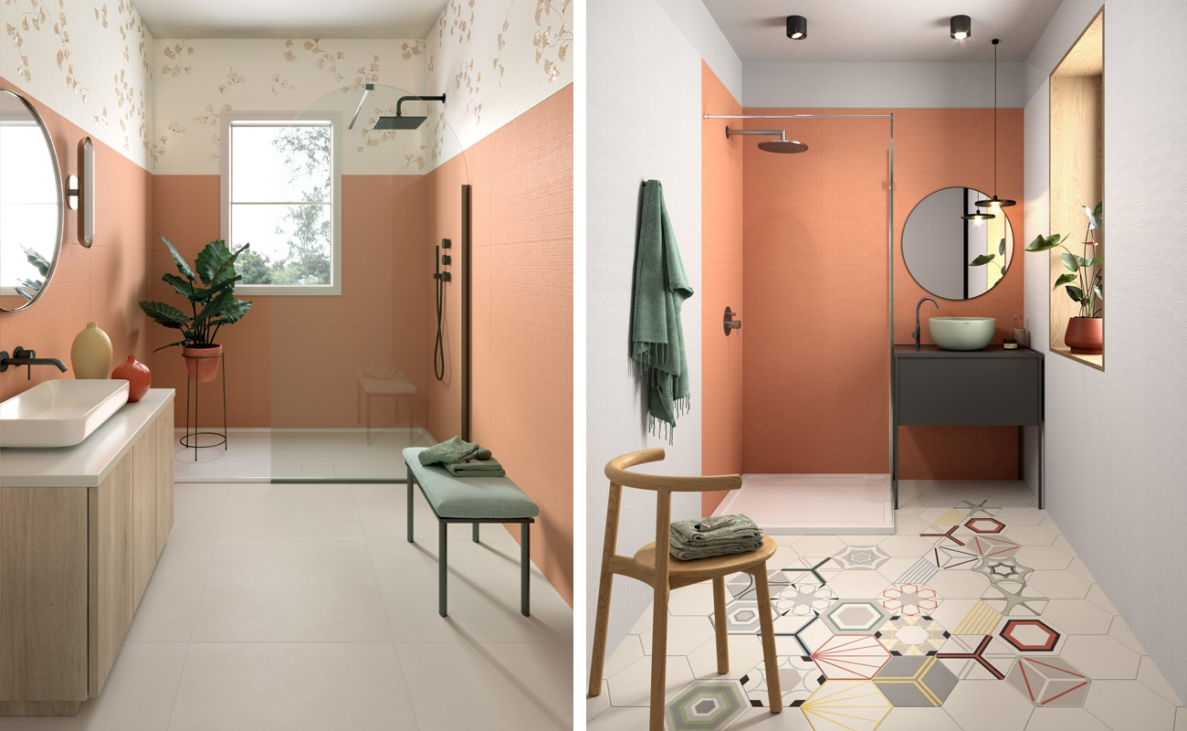
Combinations in energy, under the banner of the 2024 colour trends
For those looking for a bolder contrast always in the spirit of the 2024 colour trends, the combination of strong but complementary nuances can be an excellent choice to create dynamic and stimulating environments.
And so we come to the Pairings palette, with energetic combinations that see bright green, teal grey and floral patterns expressed to their fullest potential, along with Peach Fuzz in its most playful variant.
Here, applications can cover a wide variety of spaces, from the bathroom to the kitchen and more.
As in these examples with the Multiforme 1741 wall-mounted, where compositional freedom meets a holistic approach to design, establishing a sophisticated dialogue between the shine and depth of the material, for an unexpected and ever-present visual dynamism.
Would you like to get more ideas on how to incorporate the Pantone colour 2024 and benefit from direct advice from our team of experts?
Tell us about your project, we will be happy to help you find the most suitable surfaces for your composition.