Pantone of the year: 2021… a double billing!
Here are the colours selected by the Pantone Institute to leave behind what was a far-from-bright 2020
After a complex 2020, to say the least, we all face the new year packed with goals, resolutions, and above all full of hope, for a 2021 that’s more “normal” and light-hearted than the year before.
These hopes and expectations are also shared by the experts of the Pantone Color Institute, which - like they do each year - are called upon to select the symbolic colour of the coming 365 days, thereby influencing the world of design, fashion and, more generally, the new colour trends.
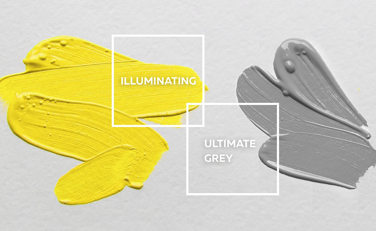
For the second time in the history of this “award”, two colours rather than just one were picked to accompany us throughout 2021: after the colour of 2020 Classic Blue, Pantone selected the shades of Ultimate Gray and Illuminating which, as the names suggest, represent a cold neutral grey and a warm and bright yellow. So why these two colours in particular?
A concrete and encouraging mix of colours, capable of conveying a message of stability and positivity, despite the tough times we are all facing.
In the words of Leatrice Eiseman, Executive Director of the Pantone Color Institute:
“The mix of Ultimate Gray - stable over time - and Illuminating yellow - so vibrant - expresses a message of positivity supported by fortitude.
Practical and rock solid, but at the same time warming and optimistic, this combination of colours conveys a message of resilience and hope.
We need to feel that everything is going to be better, it is something essential for the human soul.”
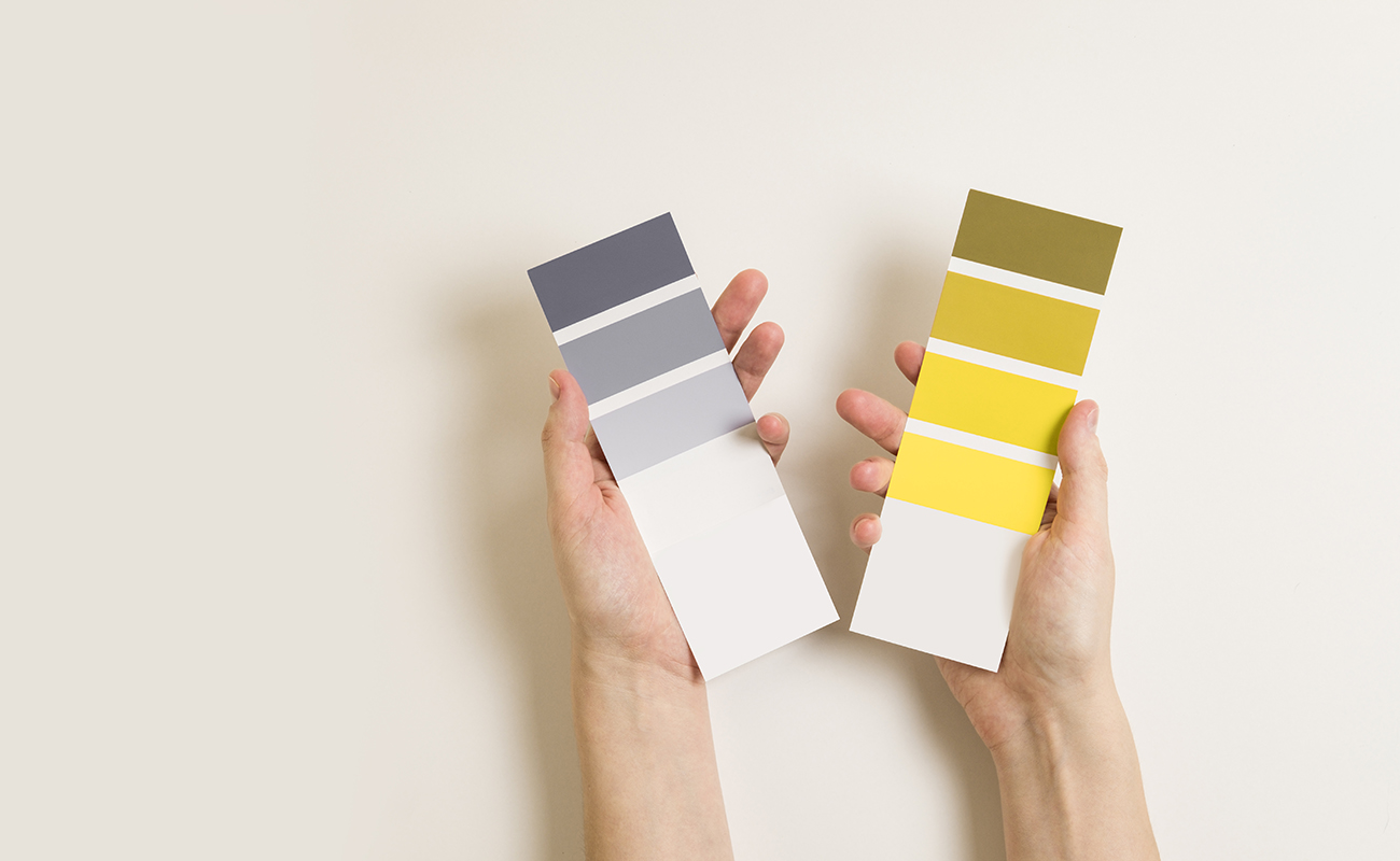
PANTONE 13-0647 Illuminating is a warm, bright yellow shade that shines full of vivacity and reminiscent of the colour of the sun. PANTONE 17-5104 Ultimate Gray is on the other hand a reference to immobile and safe matter, which therefore brings to mind a feeling of solidity, firmness and resilience.
This unusual combination of colours is the obvious demonstration of how apparently different elements can in actual fact liaise and come together in a message of positivity and stability.
As usual, the Pantone recommendations have spread quickly among interior design professionals and these new colours are already proving popular in the most recent interior designs: designers and interiors fans are beginning to play with this unusual yet vibrant pair, to create scenic effects in the same room or to distinguish different areas of the same project, above all in residential refurbishments.
Elegant, intense and at the same time modern, grey is the perfect colour for decorating the bathroom, the bedroom and the most accommodating spaces in the home, thanks to its ability to convey a sense of safety and stability: ideal both as floor and wall tiling, it is the best choice to create a neutral base, for recesses or entire surfaces, which can subsequently be embellished with designer furniture and colourful accessories.
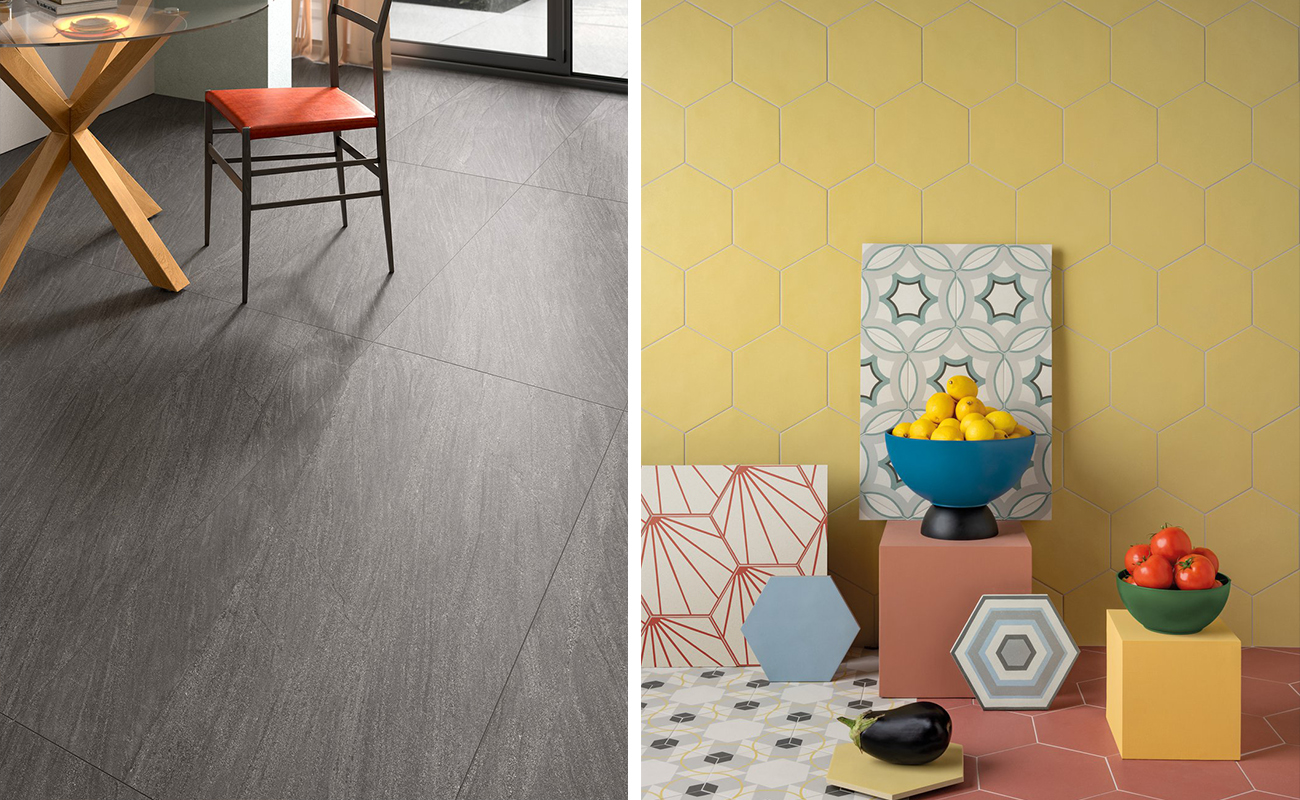
While grey is quite a versatile staple which has a multitude of uses, we do advise against an excessively extensive use of yellow, perhaps as the sole feature of a room or of the entire home. It would be better to opt for targeted applications and softer pairings, with neutral hues, which you won’t tire of seeing over time. The yellow/grey combination, for instance, is perfect for daytime settings, i.e. the sitting room, dining room and kitchen.
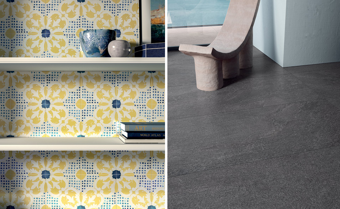
The sunny shade of Illuminating can be used to create bright accents in certain alcoves throughout your home, perhaps using it to brighten up some detailing in your textiles, paintings, tableware or other accessories. As an alternative, you could transform the look of your walls entirely by tiling them with Cementine tiles featuring bright, coloured patterns, capable of bringing to mind carefree summer days spent at the seaside. Or you could team it with other bright colours, such as blue and green, to design even more informal and bold domestic settings.
If you’re thinking of using these colours for your home or interior design project, the Marca Corona ceramic tile collections are just right for you!
The new Encode and Star Road stone look collections, two Marca Corona stoneware floor and wall tile offerings, come in elegant and versatile shades of grey, designed to imbue the surfaces of your home with all the sophistication and authenticity of stone.
If, on the other hand, you want to let your creativity with colour loose, you could pick Storie d’Italia and Paprica, which prove very popular with designers and industry experts thanks to their variety of patterns and hues.
Storie d’Italia offers matte Cementine tiles and glazed majolica tiles inspired by the rich decorative tradition of the Mediterranean, while Paprica bets on its hexagonal shape, available both on neutral coloured backgrounds and in original combinations of geometries and colours. Both collections ooze positivity, and are available in sunny and bright yellow, the same shade as irresistible Illuminating 2021!
So why don’t you combine the various Marca Corona stoneware collections to create attractive, reassuring yet vibrant settings, in perfect Pantone 2021 style?