How to renovate your home with colour: here are our tips to customise domestic settings
Discover the trendiest shades for the floor and wall tiles of your home!
After years of interior designs distinguished by minimalism and neutral hues, today colours are making a comeback in home design projects, especially in soft, pastel versions: cheerful yet concurrently relaxing, they lend every setting a sophisticated and original look, adding that touch of character that black and white homes lack.
You can opt for coloured walls matched with retro-style cementine tiles or neutral floor tiles, or you can take a leap of faith with patterns and colour on the floor tiles, played down with restful, pale painted walls. You can choose to combine contrasting colours, or to arrange a progressing variety of shades of the same colour. You could distinguish each room with a different colour or pursue chromatic consistency between the various settings. In short, the decorative possibilities with coloured floor and wall tiles are almost endless, it all comes down to personal taste!
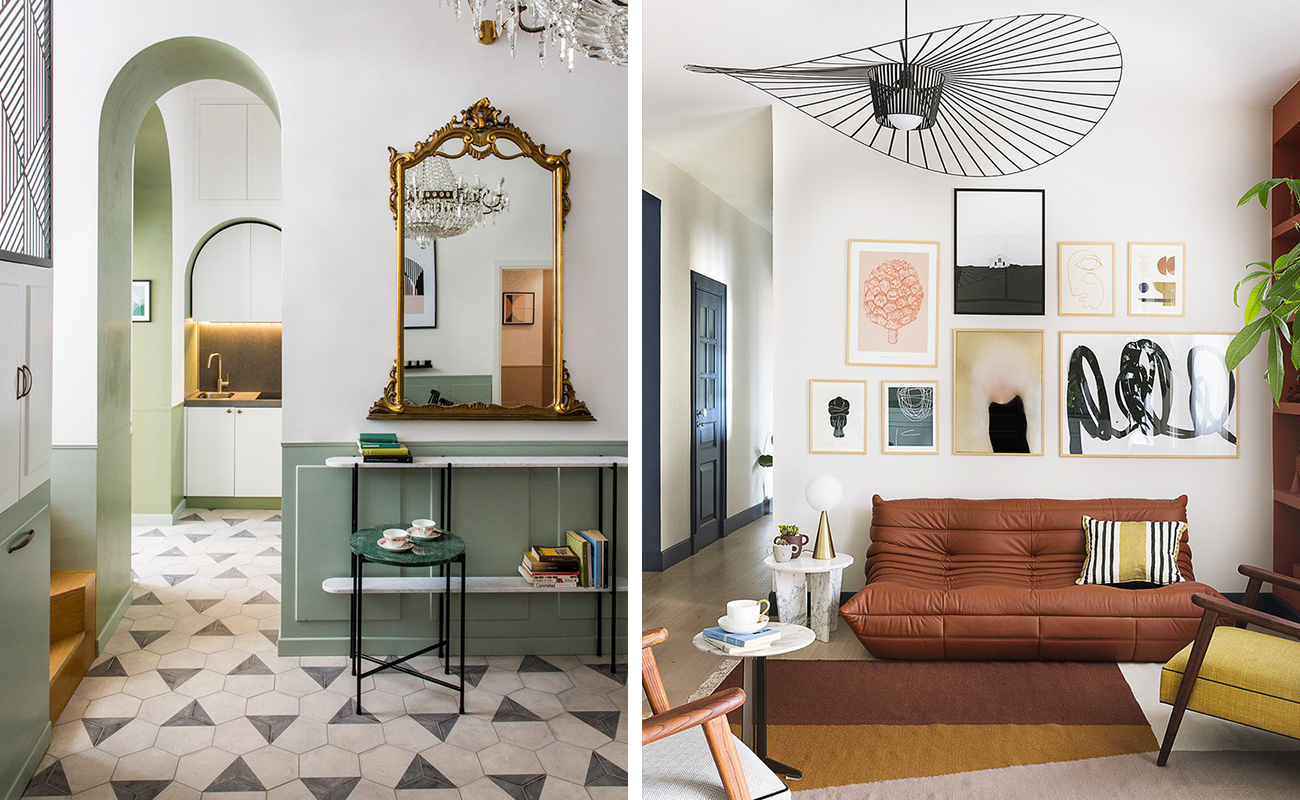
For instance for an understated style, you could concentrate on coloured surfaces teamed with a few simple and versatile items of furniture; for more eclectic and trendy interiors on the other hands, you can opt for brighter hues, bolder mix & match choices and designer details. An example? The Casa Moreno and Geometrie di Colore residential projects, two private homes where the pastel colours picked for the walls and furnishings blend in seamlessly with the chalky hues and attractive decorations of our Terra cementine tiles.
So which colours should you prefer for your home? The range to choose from is as extensive and stimulating as it is complex. Contacting a professional can definitely help get an idea of the most suitable colour combination for the setting to be designed, to accommodate your personal taste. But in the meantime, why not gather some ideas by reading this miniature guide to using colours in domestic settings?
First of all, to each room its own colour! We don’t mean creating multiple settings that are necessarily all a different colour, but rather keeping in mind that a colour may not always be suitable for all intended uses. For instance, bright and gaudy colours are perfect in the living room and kitchen, but they could break your concentration in a study or disturb your relaxation in a bedroom.
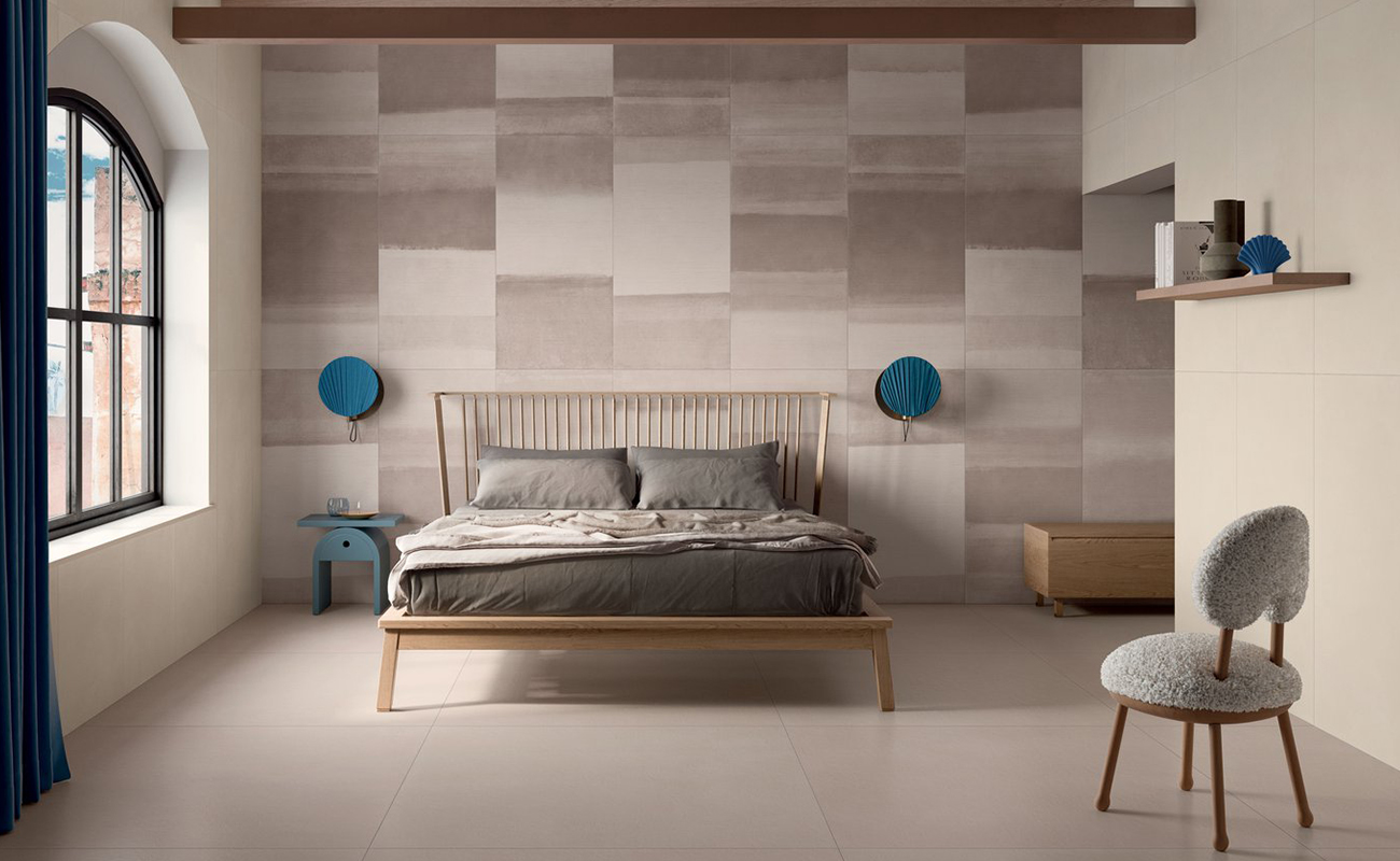
For your sleeping quarters, it’s best to choose floor and wall tiles with relaxing and reflective colours, perhaps only adding small splashes of colour in the form of fabrics or furniture.
In addition to the classical scales of grey and earth, these days interior design trends tend to go for more original and sophisticated hues, such as Pantone 2020 Classic Blue: this particular shade of blue manages to create a sense of intimacy and relaxation, and it is conducive to sleep. You can combine it with more neutral colours, such as dove grey or grey, or team it with several shades of blue and antique pink.
The Stonecloud collection of stone effect stoneware also offers a refined blue variant, devised specifically to embellish various settings with discretion and elegance. If on the other hand you prefer a relaxing but more enveloping space, then opt for warmer colours, such as those of the Overclay floor and wall tiles, inspired specifically by the shades of the desert and perfect in combination with other natural materials, ethnic furniture or shabby chic interior design styles.
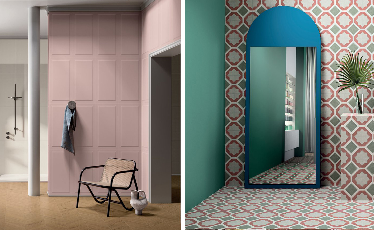
You should also discard the idea that pink is a purely feminine colour. This is a super versatile, on-trend hue! Why not use it for example to decorate your bathroom?
You can choose classical sanitary fixtures with clean-cut shapes and play them down with more attractive coloured surfaces, such as the pastel panelling of the Victoria wall tiles, or the cool, decorated Tortona cementine tiles.
If you prefer a more eccentric style, then choose even bolder shades of pink, such as those of the Bold wall tiles, devised to inject a burst of energy into any bathroom, thanks to its original three-dimensional patterns.
To add that final modern touch to your coloured bathroom, do not forget to pick fabrics and towels that match the nuances of the floor and walls, or instead pick taps and fittings with a metal or satin effect in total contrast!
However, it is in the sitting room and kitchen that you can truly let your imagination run riot with unprecedented combinations of materials, furnishing styles and, obviously, colours! These two rooms, which are often joined in airy open spaces, can play host to bolder and brighter hues, such as sky blue, orange or green, which can convey cheer and optimism to the settings... and to their inhabitants.
In this case too, you can combine several contrasting colours, or fall in love with a single hue, also replicated in the furniture and accessories. If you prefer a more discrete result, then opt for colour and decorations on the floor tiles, and lighten it up with pale restful walls, which are perfect for capturing the light and enhancing the perception of space.
Often when one thinks of colour one’s thoughts immediately go to glossy cover page settings, which are deliberately loaded, fanciful and eye-catching, but probably excessive and a bit too much to live with, day-in day-out.
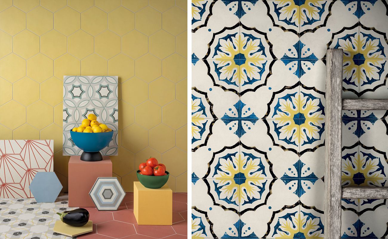
In actual fact colour is an incredibly versatile and multifarious decorative element. Let us think for instance of 1950s interior design styles, which have made a forceful comeback lately. This trend embraces colour in all its variants, from the powdery shades of decorated cementine tiles to the bright colours of glazed majolica tiles. Even nostalgia buffs can now find solutions to their desire for colour through modern reinterpretations of those atmospheres, such as the Paprica hexagonal cementine tiles with their original patterns or the Storie d’Italia wall tiles, with their decidedly Mediterranean and retro taste.
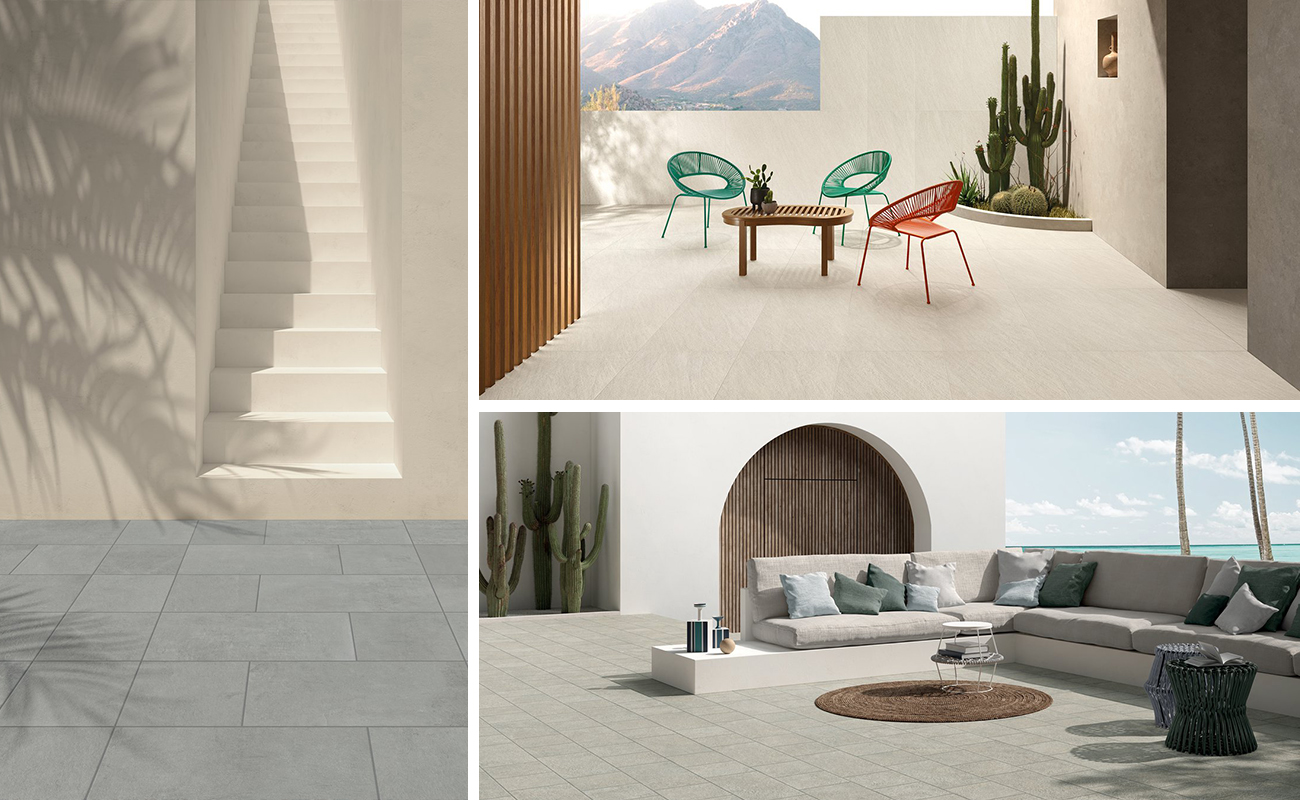
What about outdoors? It is generally best to avoid colours that are too dark, which tend to attract the heat of the sun’s rays and create what is commonly referred to as a "heat island". It is preferable to pick hard-wearing surfaces in neutral colours, such as the porcelain stoneware floors of Encode, a stone effect collection with bold and modern patterns, or the small outdoor sizes of Vie della Pietra, available in 7 different colour variants. The durability and practical cleaning of stoneware will allow you to spend your free time as you see fit outdoors, doing gardening or tending to colourful flowers and plants, without the fear of getting your outdoor spaces dirty or ruined. When we think of life in the open air, don’t we usually conjure up something carefree and colourful?!