The future is truly colourful!
In recent years, international designers have decided to focus on colour, using it everywhere and in every possible nuance! Neutral or eccentric, delicate or vibrant, the various shades are called upon today to bring a fresh, modern style to homes, shops and hotels.
The colour of the year is Living Coral!
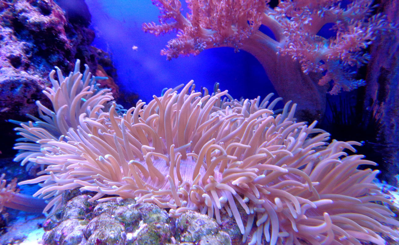
Of all the colours, the focus this year is firmly on pink!
After Ultra Violet, the Pantone shade for 2018, and Millennial Pink, it’s now the turn of the coral shade PANTONE® 16-1546, recently named as colour of the year for 2019, “evocative of how coral reefs provide shelter to a diverse kaleidoscope of colour”.
Pantone has announced the colour of the year!
Living Coral is a delicate coral hue with golden and peach undertones, which “emits the desired, familiar, and energizing aspects of color found in nature”, in the words of Laurie Pressman, Vice President of the Pantone Color Institute.
Living Coral is a colour with a zen spirit: carefree, lively and reassuring. It symbolises our inborn aspiration towards optimism and happiness, and encourages us to recover the authentic nature of experience and close personal relationships. We’ll be seeing it everywhere, from make-up and fashion to home decor and interior design, with a fresh, sophisticated, eco-friendly allure played out on a soft palette of vibrant hues.
Fifty Shades of Pink
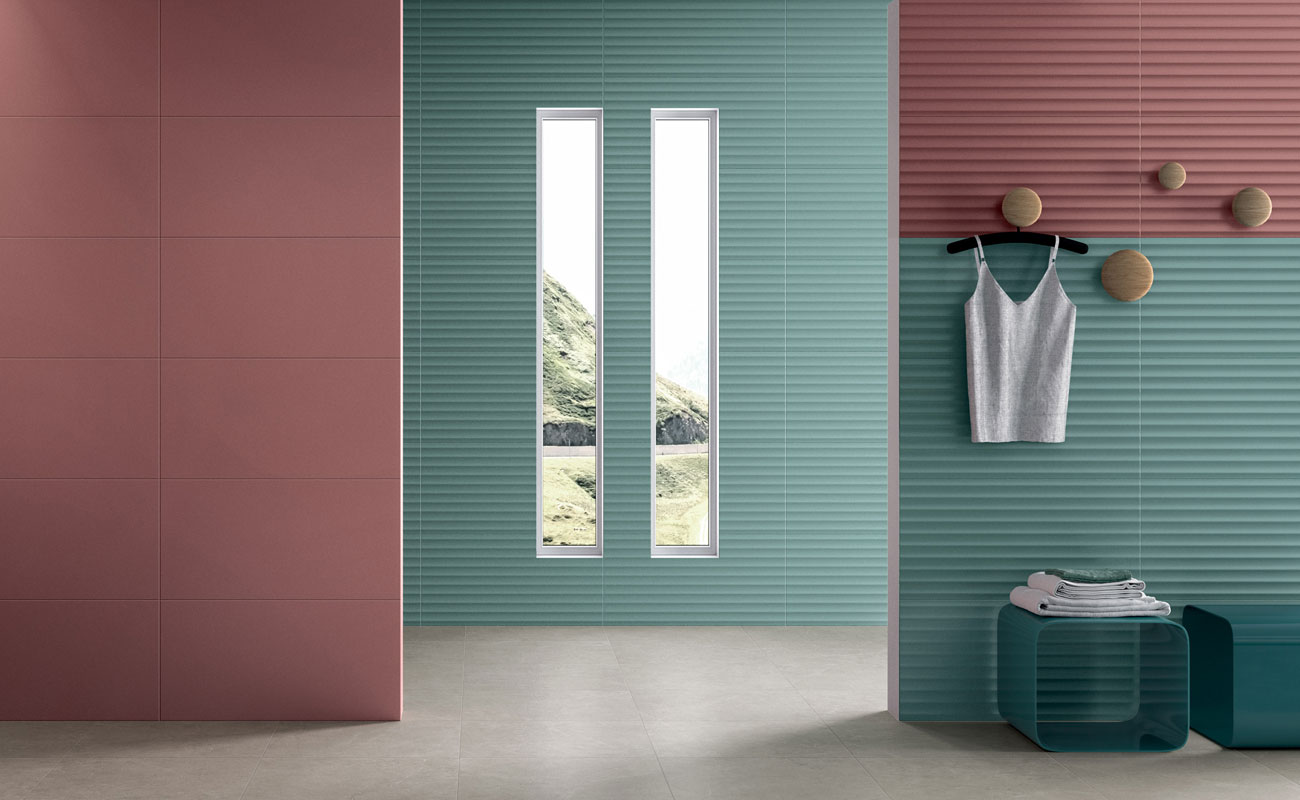
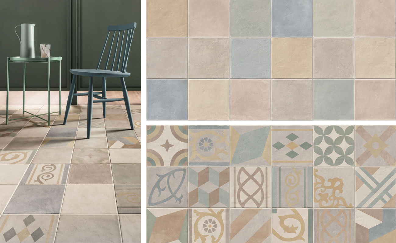
Living Coral is a celebration of life: soft, full and chic, perfectly in tune with the colours of the coral reef, from sea green to turquoise, as well as with the more earthy shades of ceramics. A delicate, playful nuance, like the Chalk collection, our cement-effect porcelain stoneware that comes in a broad, elegant colour palette in square, brick and diamond shapes.
Chalk brings new dusty, chalky shades of pink to ceramics, gracefully combining them with other pastel nuances, such as air force blue, yellow and sage green, and a total of 38 different highly decorative geometric patterns. A balanced, appealing combination of subtle yet lively shades, ideal for creating extremely decorative compositions on floors and walls, helping to create intimate, engaging ambiences.
Another interpretation of colour: the glossy allure of Ossidi
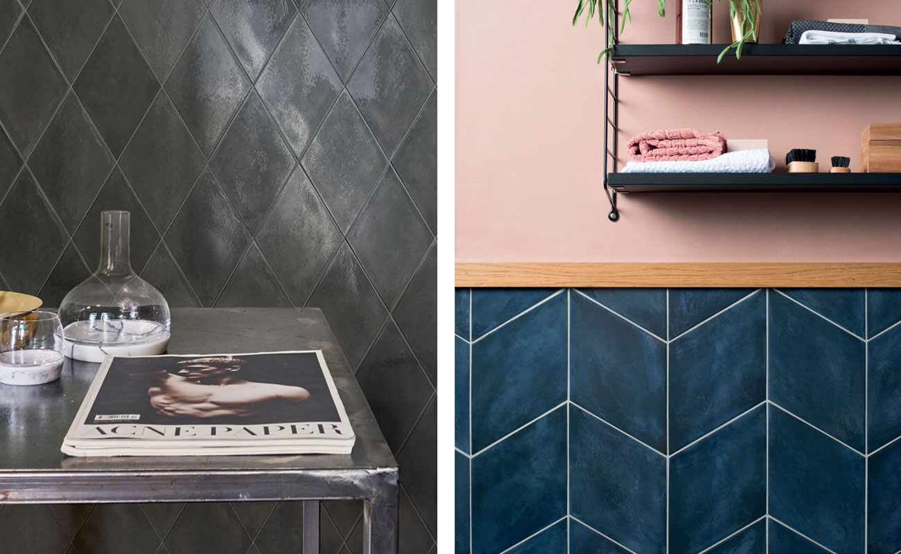
The desaturated tones of Chalk contrast with the full, glossy, confident character of Ossidi, an eye-catching collection of porcelain stoneware cementine tiles, available in an innovative 18.7x32.
4 diamond size that comes in a super-glossy glazed version. The 4 neutral shades, and above all the burgundy and sky-blue nuances, are so incredibly rich and infused with light that they create an enchanting interplay of reflections.
If the Pantone colour of the year has won you over and you’re already thinking of some new Living Coral furnishings or accessories, the glossy grey diamond tile in the Ossidi collection offers a striking, modern, ultra-chic partner, while for a more low-key, intimate, inviting ambience, the winning, evergreen team is formed by pink and the glossy sky blue diamond tile.
